UX RESEARCH + PRODUCT DESIGN

Kangaro

Rebranding Kangaro into a research-backed Amazon storefront experience after discovering that users did not want another stationery app.
UX Research UI Design Rebranding User Testing Figma Prototype
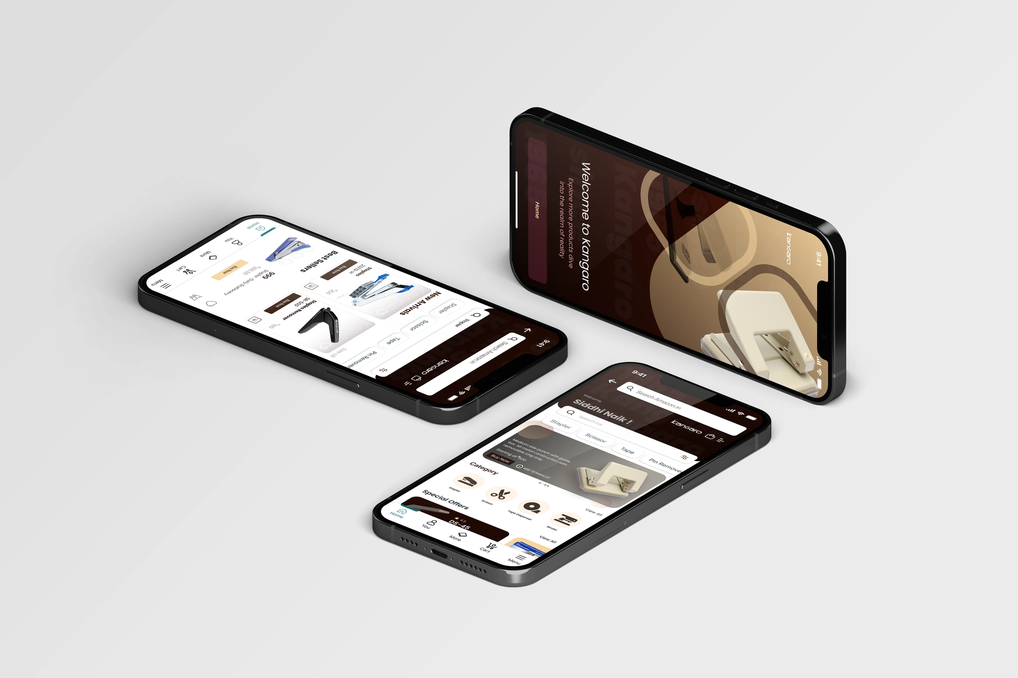
Kangaro project mockup
ROLE Solo UX/UI Designer
TOOLS Figma, FigJam, Illustrator
METHODS Interviews, research and testing
RESULT 90% satisfaction after iteration

Kangaro had products. The mobile buying experience had friction.

Kangaro already sells stationery online, but the mobile experience lacked a direct, smooth shopping and checkout flow. My original assumption was that Kangaro needed its own app.

Research changed the product direction.

Switch between the original idea and what users actually told me.

INITIAL DIRECTION

Build a standalone Kangaro app.

The first concept focused on giving Kangaro its own mobile shopping experience, checkout and product browsing flow.

ASSUMPTION
APP
Create another destination users would need to download and learn.

Instead of another app, I designed where users already shop.

01

Amazon Storefront

A dedicated Kangaro-branded experience inside a shopping environment users already trust.

02

Curated Categories

Stationery organized around school, office, craft and everyday needs.

03

Better Comparison

Similar products are easier to compare before purchasing.

The research did more than validate the design. It changed it.

I interviewed users, tested the low-fidelity experience with 10 participants and refined the solution based on the behaviors and preferences that appeared repeatedly.

USABILITY TESTING 10

Users tested the low-fidelity experience.

SATISFACTION 90%

Satisfaction after the design improvements.

ITERATION ROUNDS 2

Major refinement rounds shaped by usability feedback.

RESEARCH SIGNAL 72%

Preferred Amazon

Most users preferred buying Kangaro products through a platform they already used instead of downloading a separate brand app.

Four things changed how I designed Kangaro.

01

Users did not want to download another app for one stationery brand.

02

Amazon already provided payment, delivery, review and return trust.

03

Product comparison needed to be easier before buying.

04

Familiar shopping patterns reduced hesitation.

I grouped the noise until the pattern became obvious.

User comments clustered around a few recurring themes. Click a cluster to isolate the notes and see how that theme affected the direction.

Kangaro research board / synthesis
click a cluster
TRUST
“I already have my card saved on Amazon.”
Reviews make me feel safer buying something new.
I know how returns work there.
I trust Amazon delivery more than a new brand app.
APP FATIGUE
I would not download an app just for stationery.
My phone already has too many shopping apps.
I only buy these products occasionally.
I would probably just search Amazon.
DISCOVERY
I usually search by the type of product I need.
School and office categories would help.
I do not want to browse every product.
Search should feel familiar.
COMPARISON
Pens can look almost identical.
I compare price and reviews before buying.
Show differences without opening every product.
Size and pack quantity matter.
CONVENIENCE
I want checkout to be quick.
My address is already saved.
I like having all orders in one place.
Tracking should not require another account.

The process was not linear. Research kept changing the answer.

01 / UNDERSTAND

Start with the existing experience.

I studied Kangaro’s existing website and identified where mobile shopping felt disconnected or unnecessarily slow.

Structure first. Polish later.

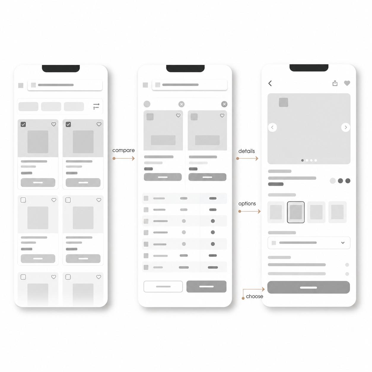
These wireframes helped plan the storefront, product browsing and comparison experience before moving into the final interface.
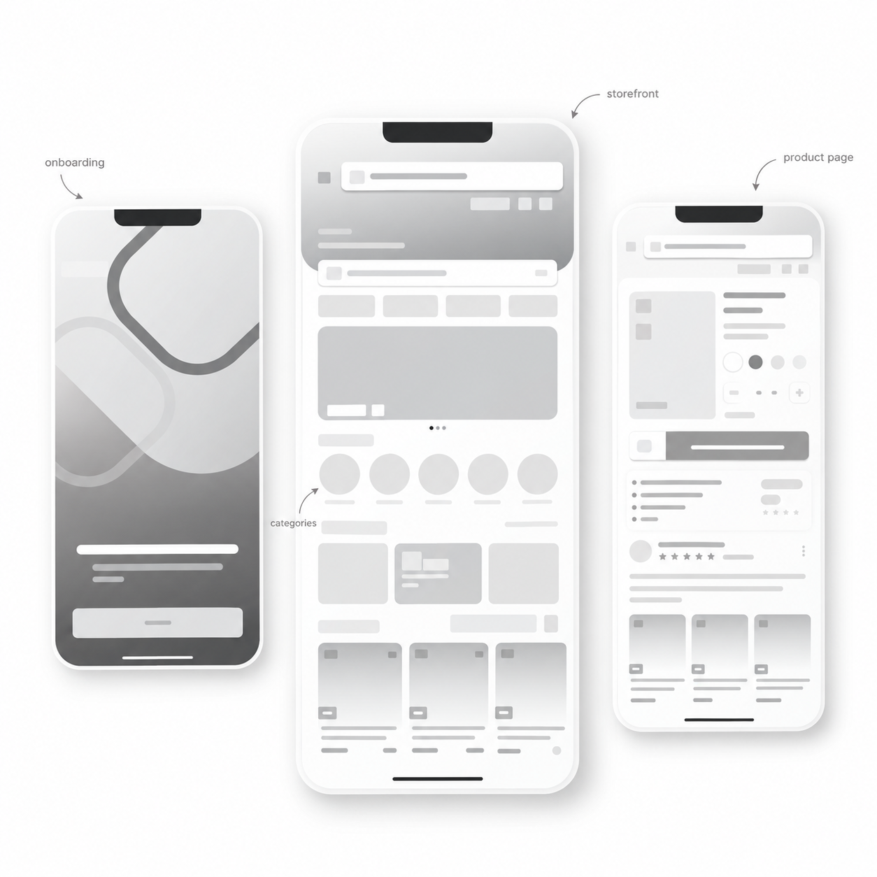
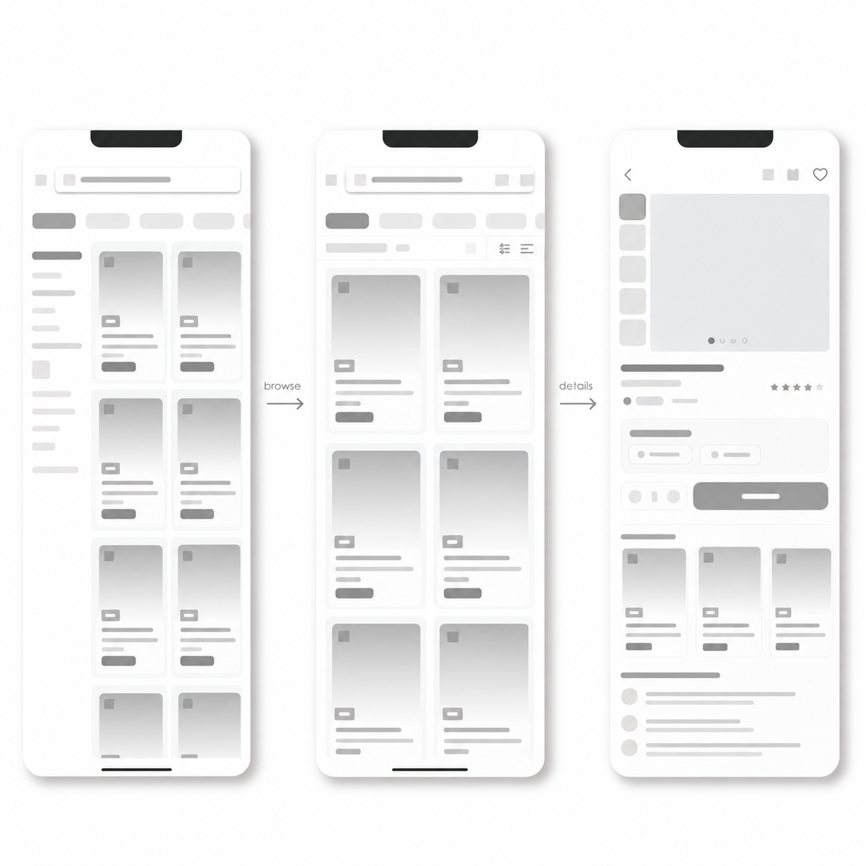
Kangaro Wireframes / exploration board
click a frame
Kangaro wireframe 1
Kangaro wireframe 2
Kangaro wireframe 3

Familiar enough to trust. Distinct enough to feel like Kangaro.

The final direction brings Kangaro into a familiar shopping environment while keeping the brand identity visible, product-focused and easy to browse.
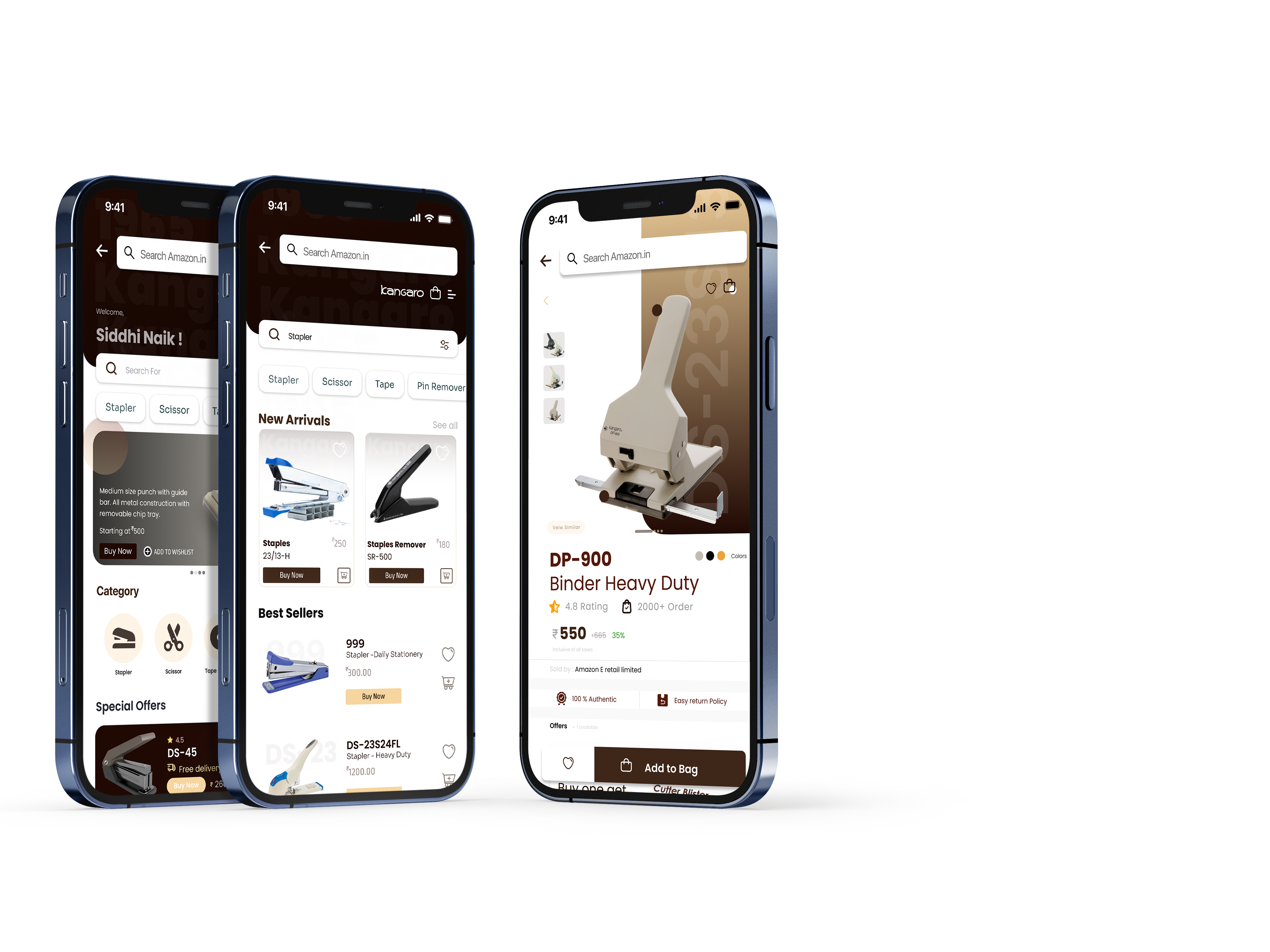
Final Kangaro storefront design
01 Familiar shopping patterns
02 Kangaro brand presence
03 Easier product comparison
04 Trusted checkout environment

Explore the storefront flow.

The interactive prototype shows the Kangaro storefront experience directly inside the case study.

Kangaro · Interactive Prototype FIGMA
10 / REFLECTION

The best solution was not another app.

This project taught me that UX is not always about creating a completely new product. Sometimes the stronger design decision is to understand existing behavior, remove unnecessary effort and work inside a system users already trust.

NEXT PROJECT

LightLab

→